Rebrand, Visual Identity, Packaging, Off-screen, Wordmark
A visual identity rebrand designed to better position the paint company for a millennial audience that values elevated, earth-friendly, and health-conscious products. Botanical graphic elements lend an organic aesthetic and were created using two off-screen techniques: stamping and photography.
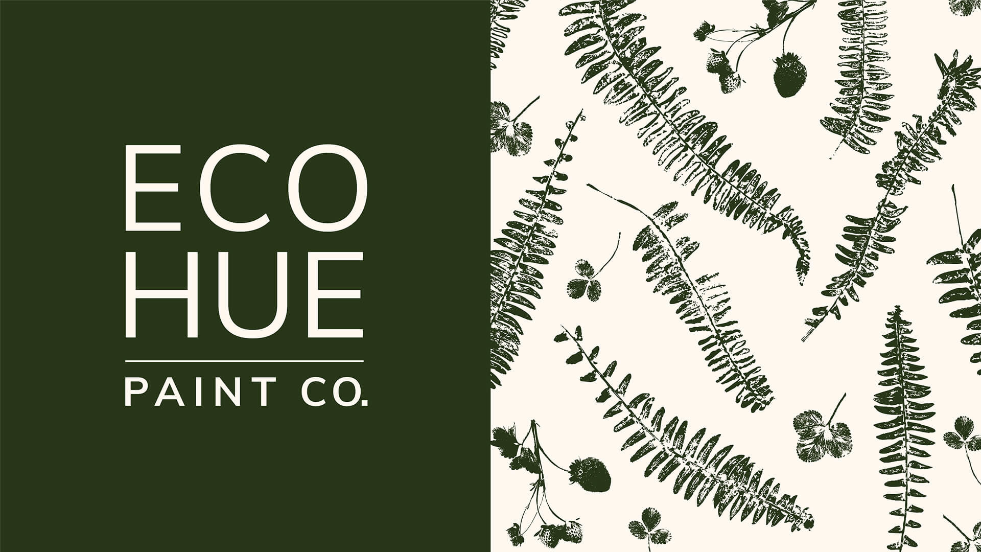
Colors and pattern to bring in an organic feel and aesthetic.
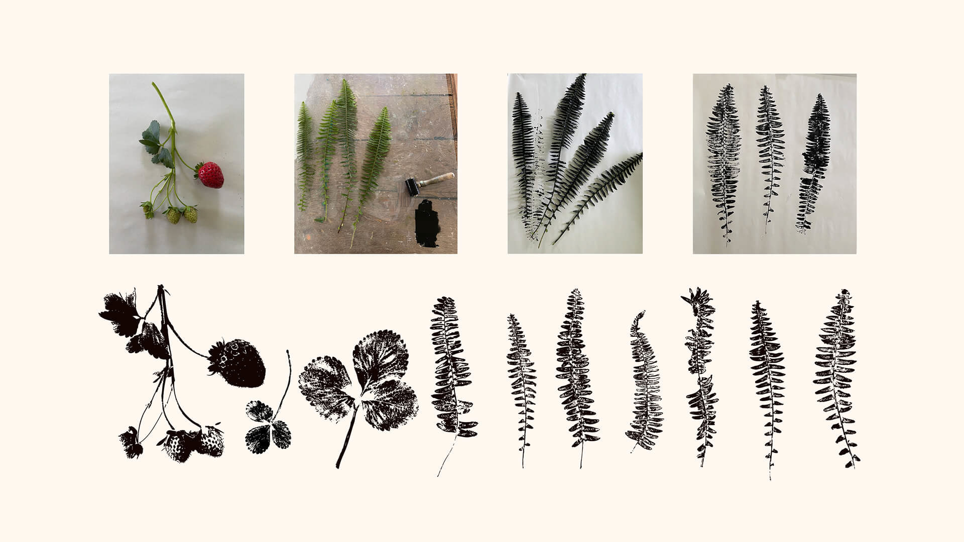
Stamping and photography were used to capture the richly textured graphic elements which were later vectorized.
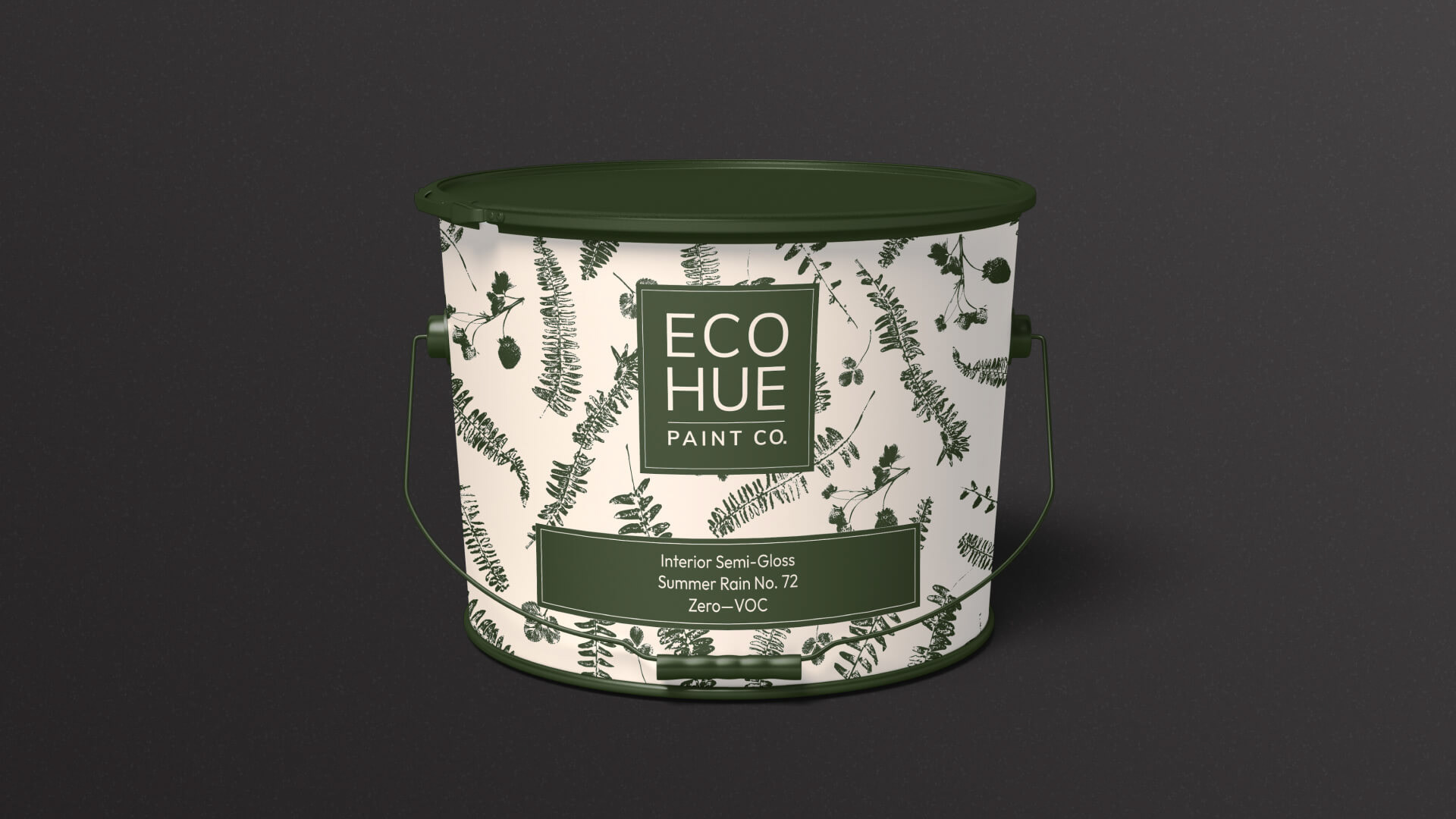
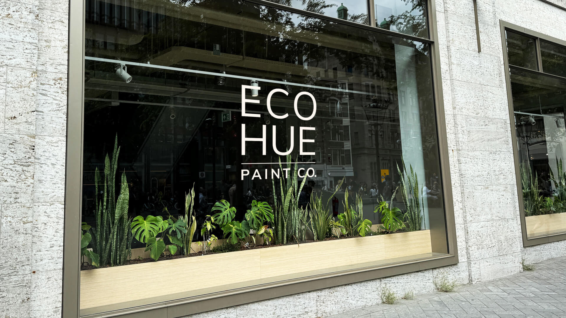
A paint can designed to have an elevated aesthetic geared to the elevated Millennial. The simple and clean wordmark brings the minimalistic simplicity that the audience also prefers.
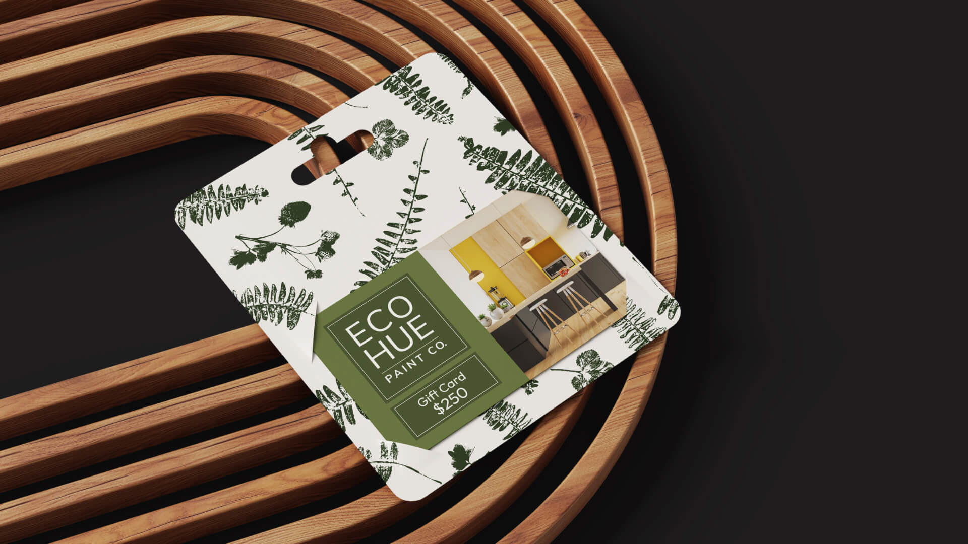
Bringing all of the elements of the brand's visual language together. Color, pattern, texture, clean typography and an elevated visual aesthetic.
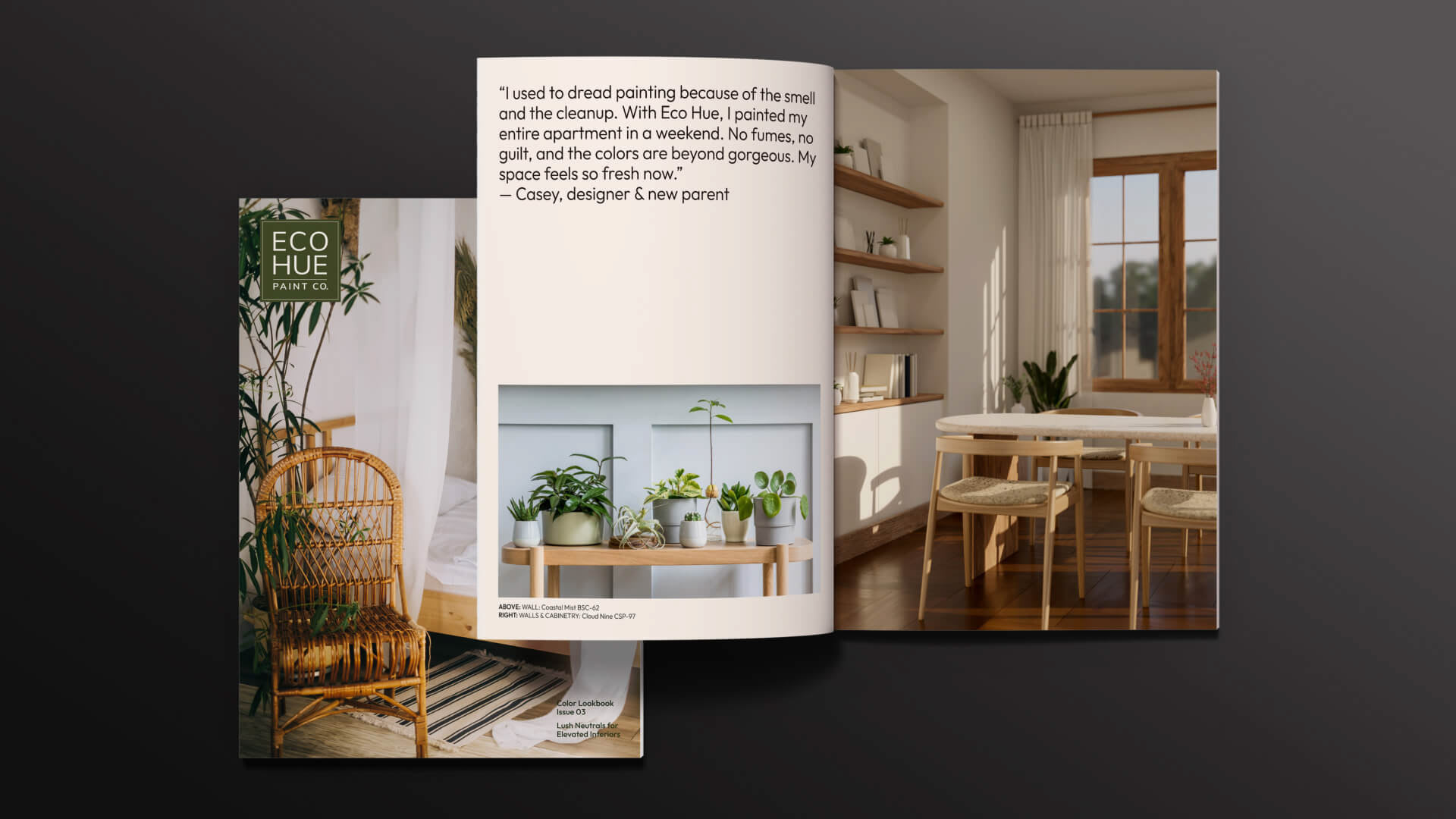
Images with natural woods and plant life worked nicely with the organic concept. The visual language within these pages are designed toward the brand's stylish and eco-conscious audience.
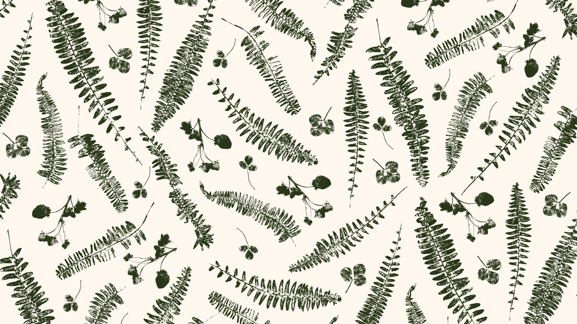
A tossed repeating pattern with an elevated feel.
This project began as student work as part of my Graphic Design studies at Shillington Education.