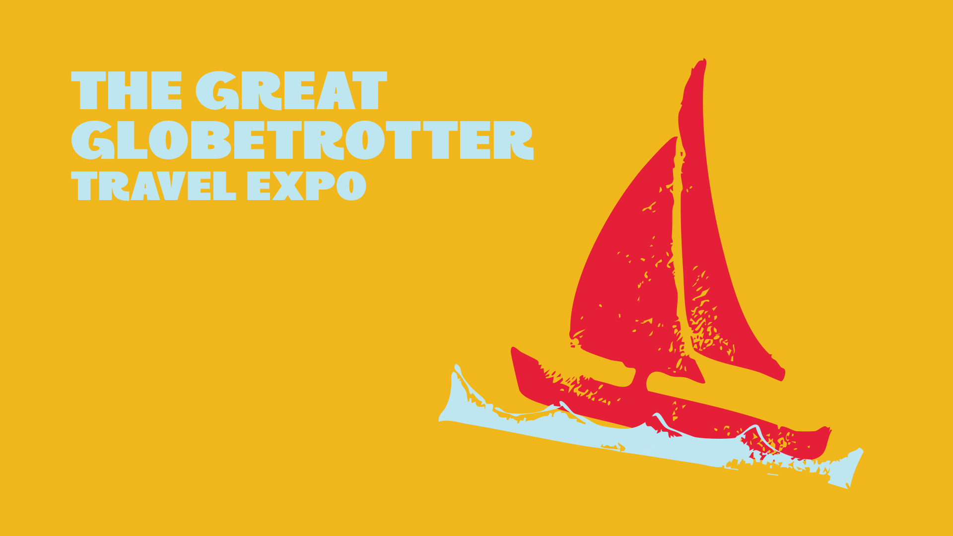
Visual Identity, Event Branding, Off-screen
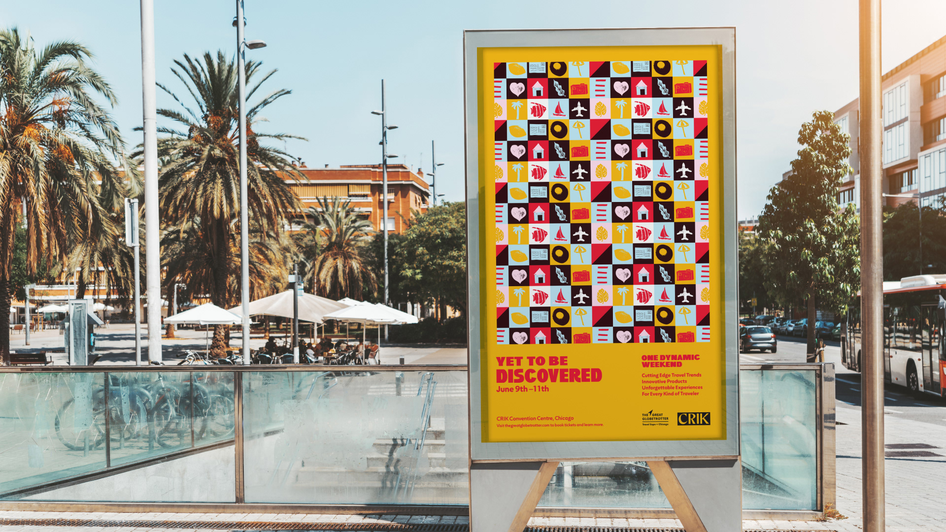
Event branding for The Great Globetrotter Travel Expo called for off-screen artwork designed for use in a variety of ways. I chose linocutting and relief printing, which were then vectorized and modified. The target audience comprised individuals from all walks of life who share a love of travel.
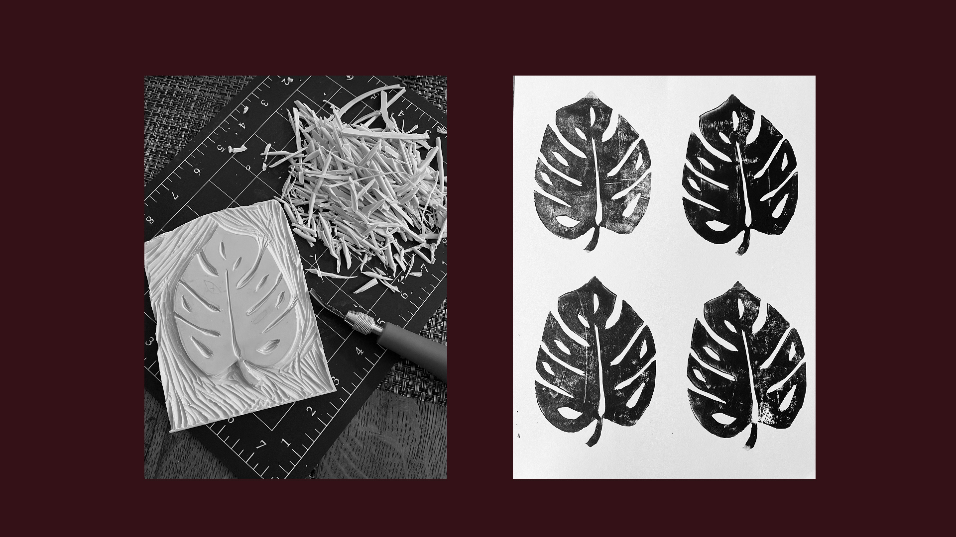
Creating travel icons with linocutting and relief printing.

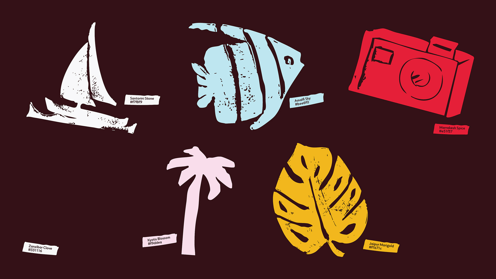
A universally appealing and exotic color palette.


These versatile icons were created to be used as a montage, individually and as a pattern.

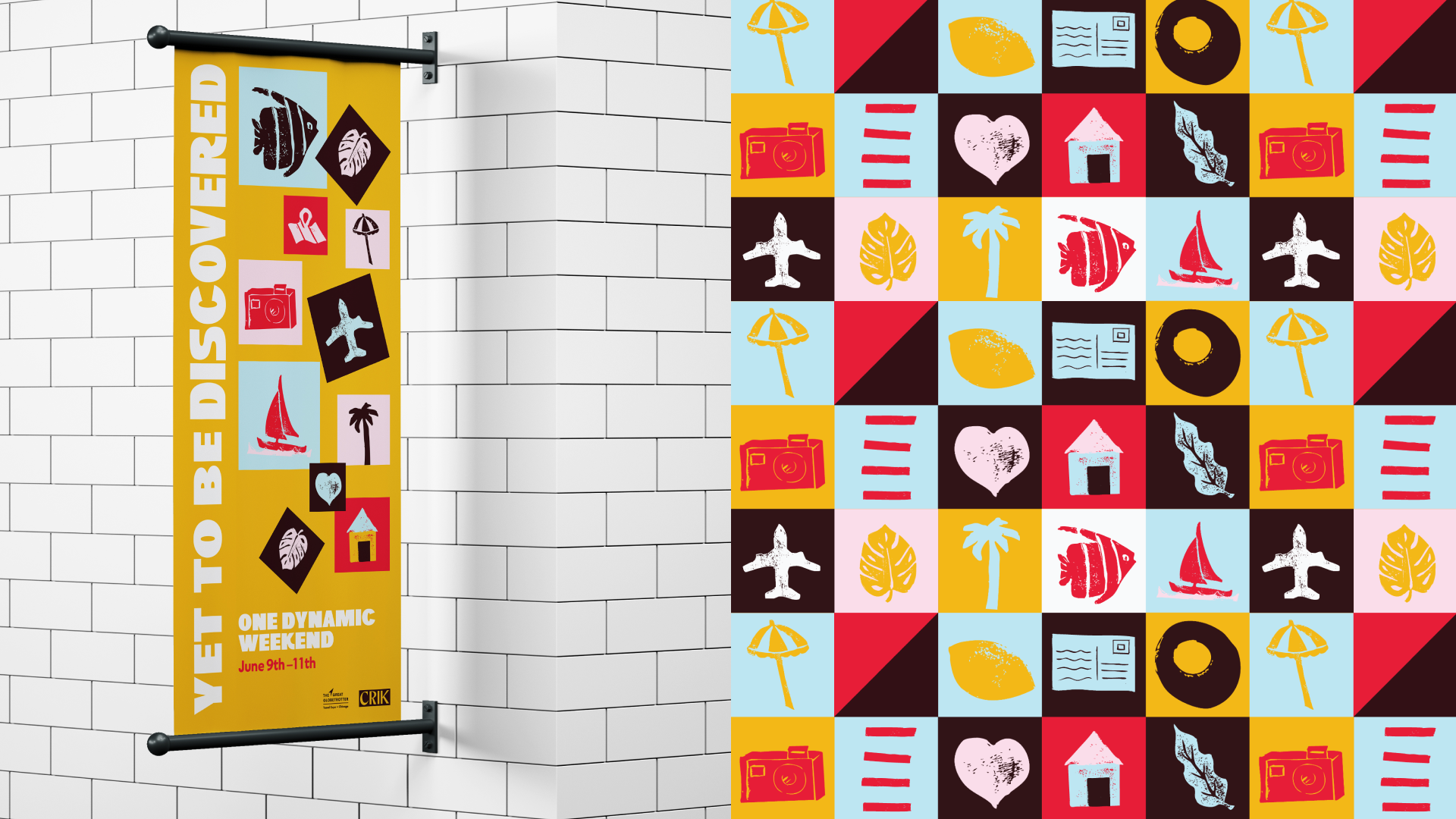
The icons, colors and brand pattern were inspired by retro Bauhaus posters.

nstagram stories created to promote the event. The icons are again used in a multitude of formats, even as bullets. The icons were designed for both universal appeal and versatility.


Beep, beep! Let's go! 🏝️
This project began as student work as part of my Graphic Design studies at Shillington Education.